01 — Onboarding architecture
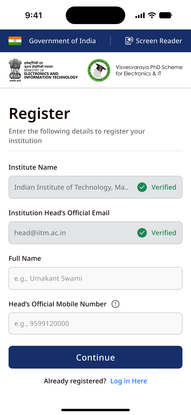
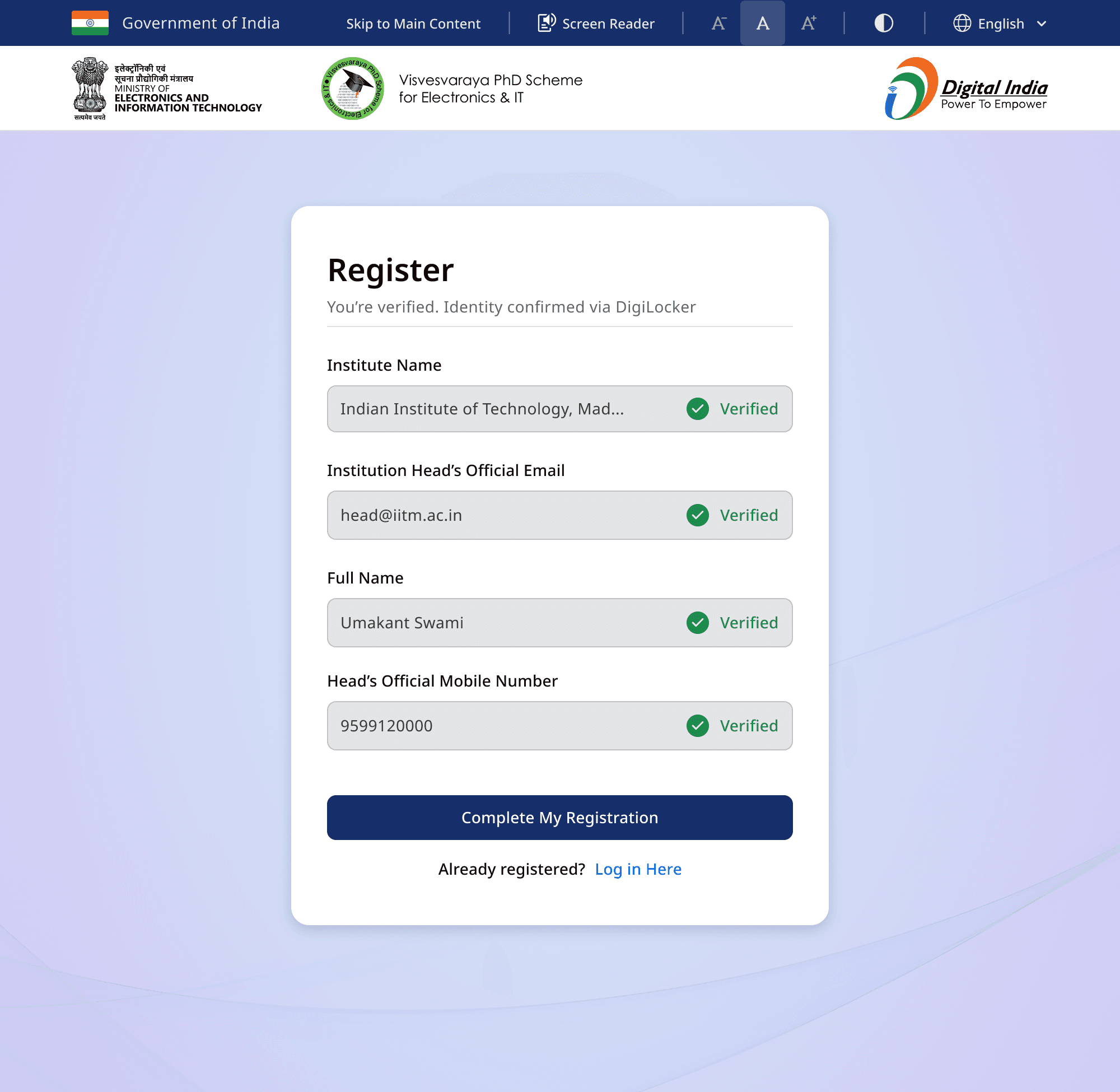
An institute isn’t a user — so I removed the account entirely.
Two of every three institutions quit before finishing signup — and every drop-off came back as a support call.
Onboarding drop-off
Manoj Vaishnav — Manager, UX/UI Design · Complex Public & Enterprise Systems
Eight-plus years across product and enterprise UX, and more recently government platforms — currently at Digital India Corporation (MeitY), designing onboarding, dashboards, and the processes behind them.
500k+ citizens served on platforms I led — and design standards that reach far beyond them.
Proof at scale
Figures come from platform analytics, support-call logs, and post-rollout surveys. Some are abstracted to respect government and NDA constraints.
Selected work
01 — Onboarding architecture
Two of every three institutions quit before finishing signup — and every drop-off came back as a support call.
Onboarding drop-off
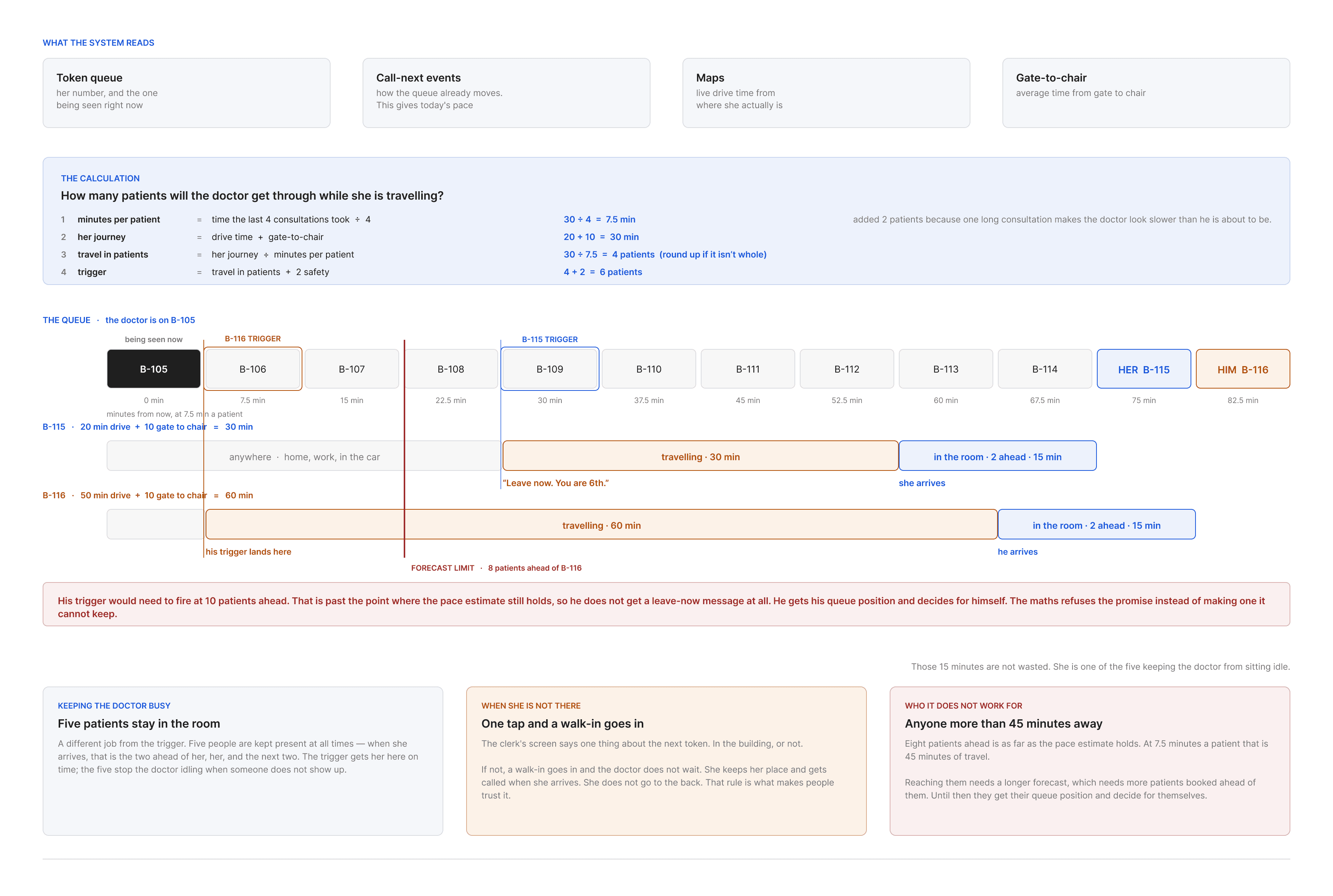
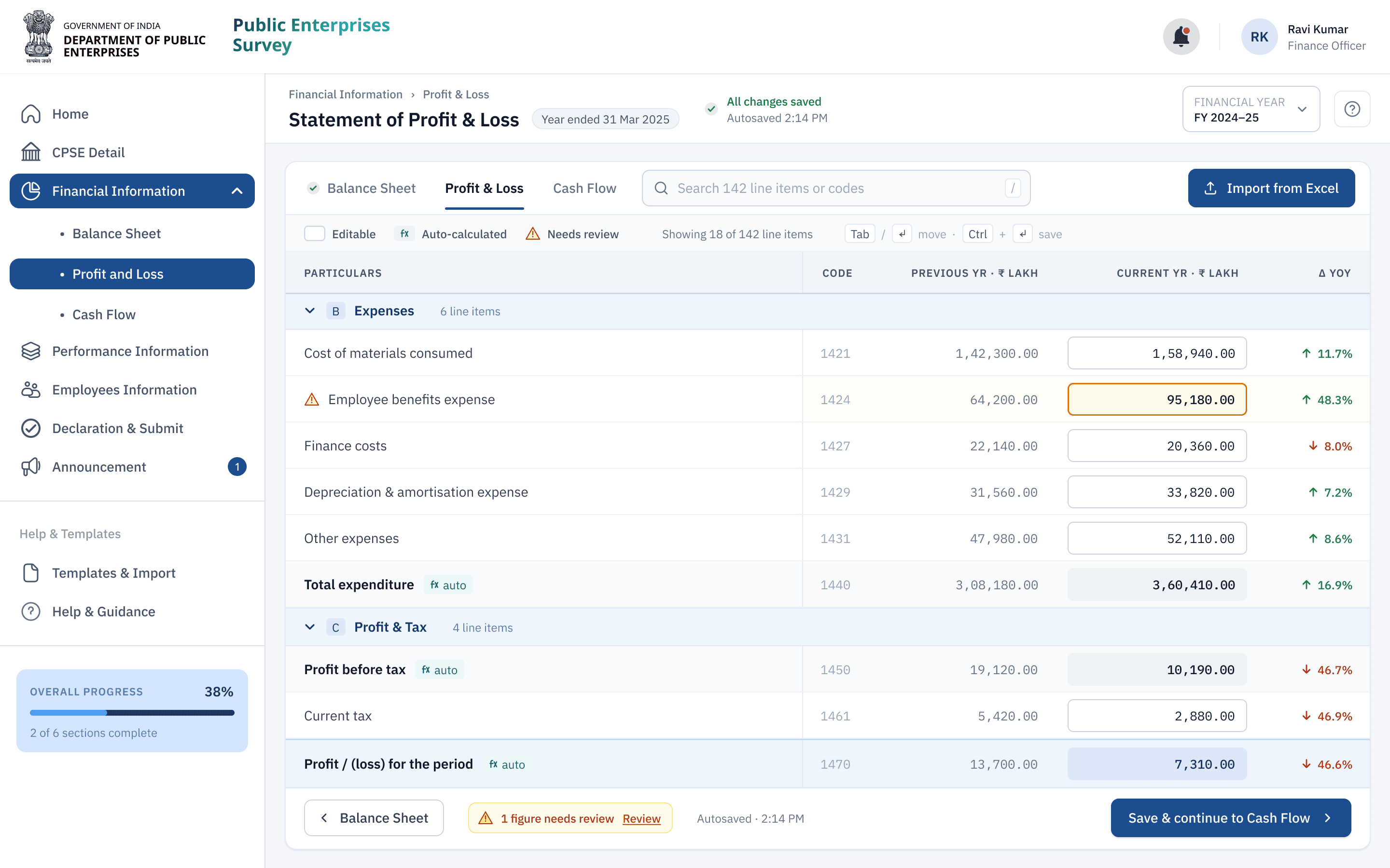
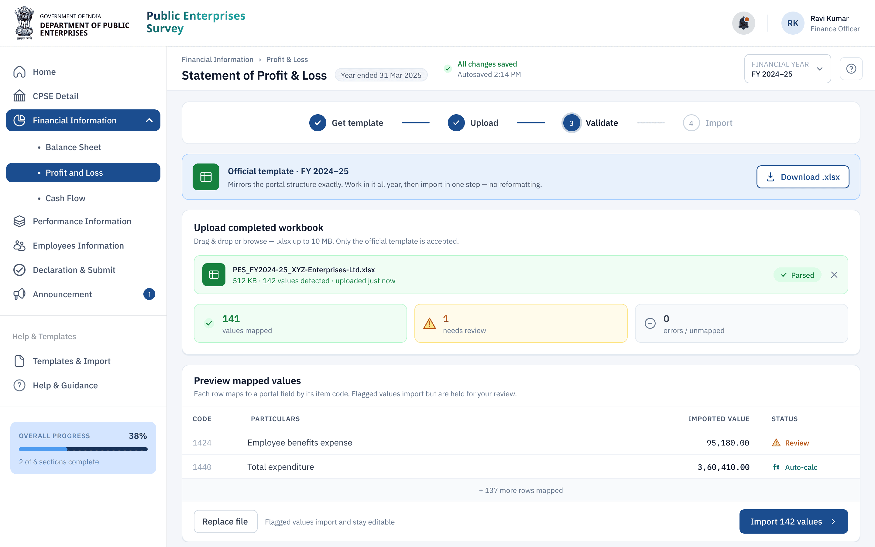
02 — Enterprise workflow
Finance teams rebuilt a year of Excel inside a seven-step portal. Most of that work added nothing.
Time to submit

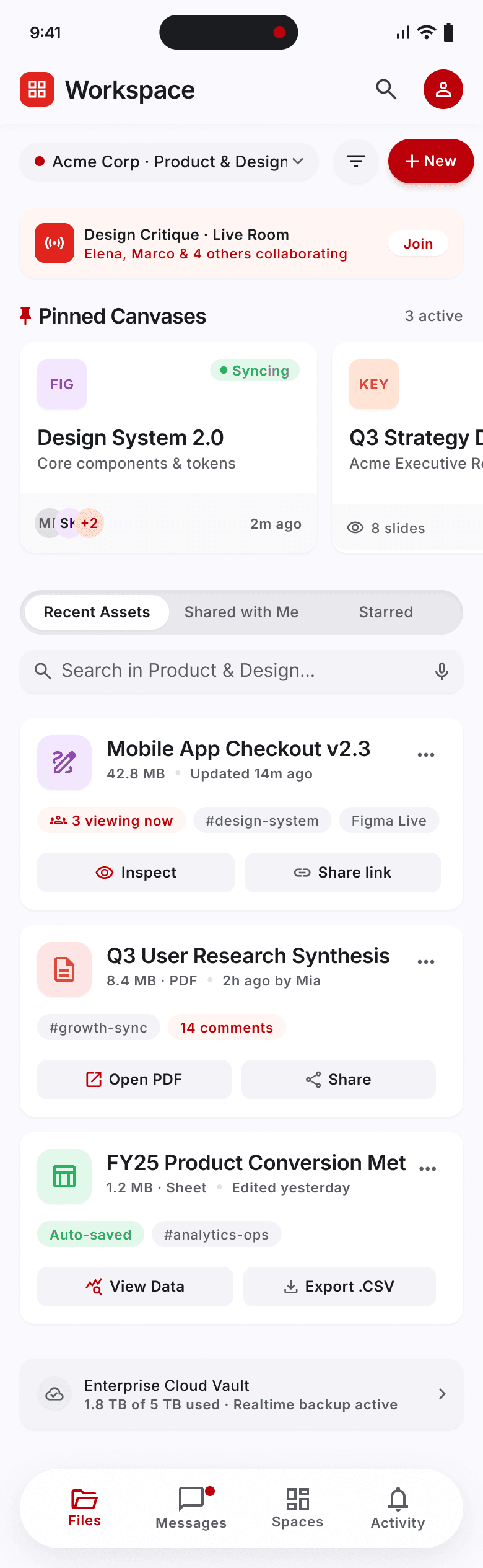
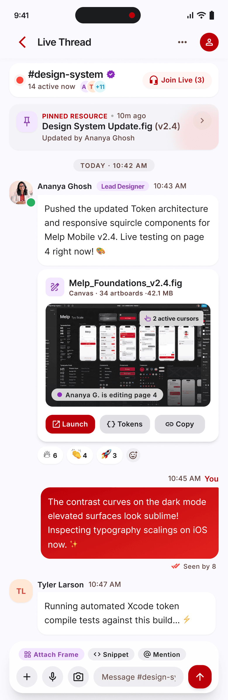
03 — Product UX
Shared files kept disappearing into chat threads — so people re-asked, re-uploaded, and lost time.
User engagement

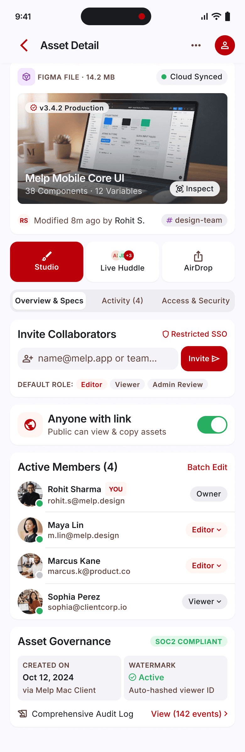
04 — Design systems
Every new screen was a chance to re-invent a button. So I built the system that made drift impossible, not just discouraged.
On one shared system

Selected interfaces
A short collection of interface work — products, startups, and client engagements — chosen for craft, not for completeness.


Product Concept · iOS
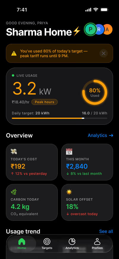
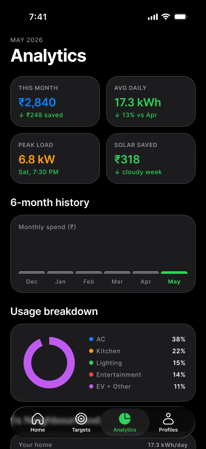
A home energy monitor built to be read at a glance. Live usage, tariffs, and targets sit in a calm dark interface where colour is spent only on the one number that matters. Every screen keeps the same rhythm, so the data lands before the chrome does.
Product & Visual Design · 2026
Happy to walk through how it’s built

Startup Product · iOS, Android & Web
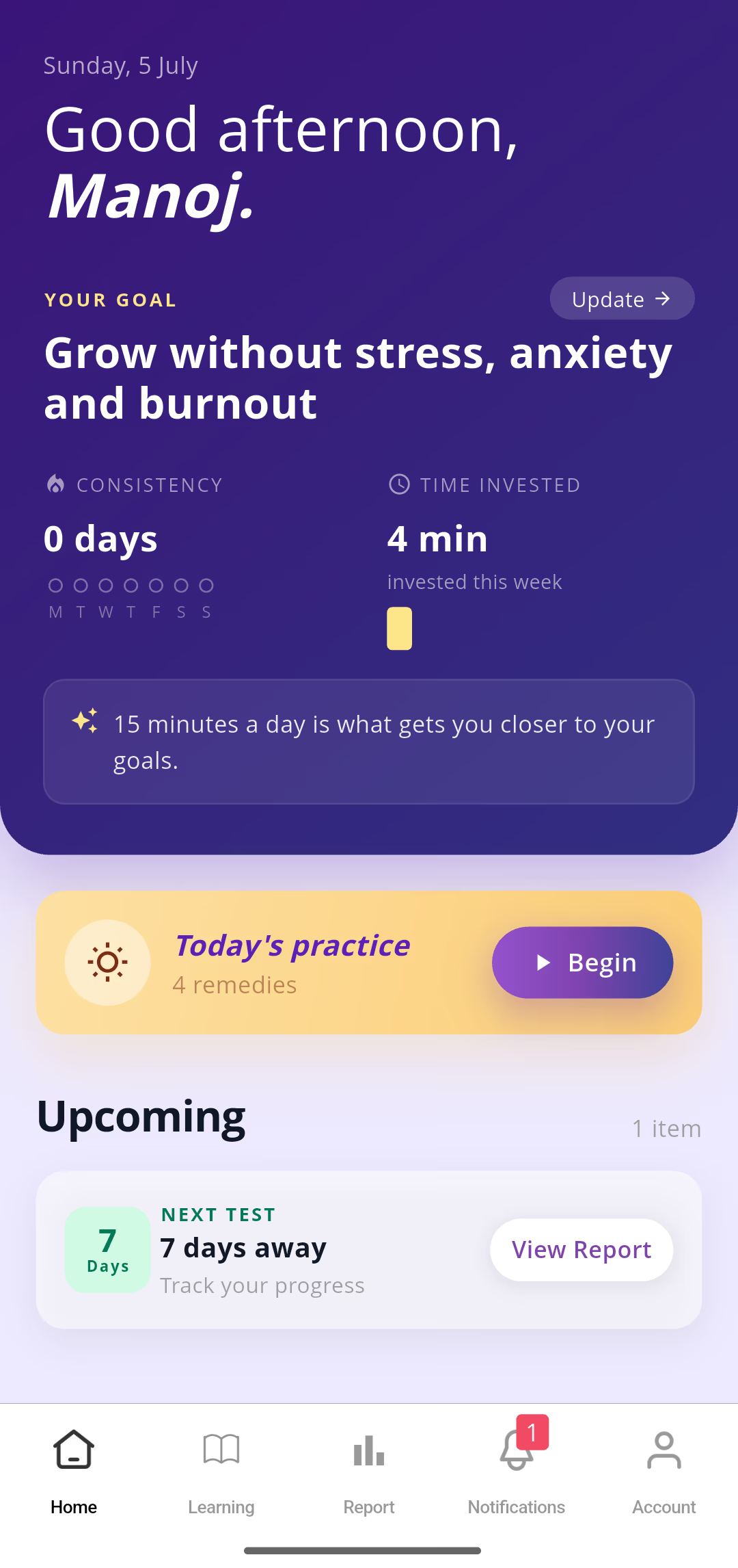
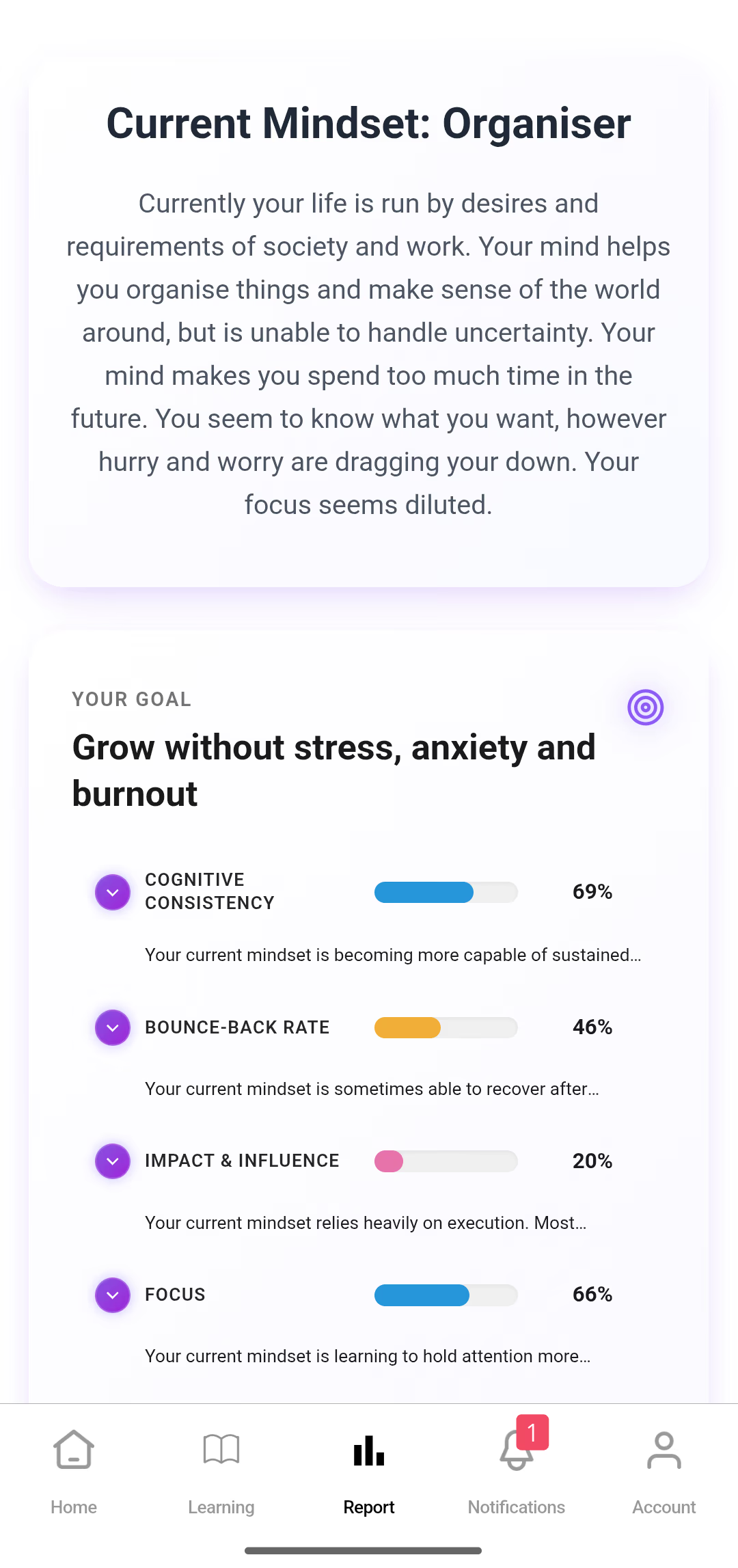
A self-wellness platform that connects seekers with gurus and teachers around the globe. The work was making a content-dense experience — feeds, courses, and personal assessments — feel warm and unhurried, so guidance always reads as human rather than clinical.
UX & Interface Designer · 2018
Ask me how we kept it human
Landing Page · Web
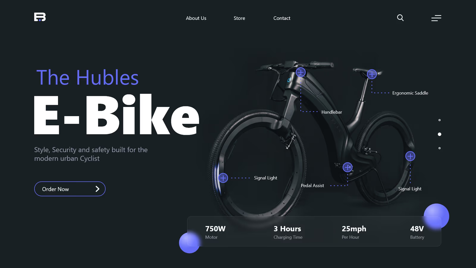
A landing page for The Hubles E-Bike, built to sell a premium urban ride at a glance. One hero product shot, annotated specs, and a tight blue accent carry the story — style, security, and range land before the fold, with room to breathe around the machine.
Lead Product Designer · 2021
Let’s talk through the craftThat’s the surface. The thinking that shapes it comes next.
How I think
None of these came from a book. Each one cost something to learn on a live system — a drop-off that wouldn’t budge, a workflow people quietly refused to adopt, a call that only looked obvious in hindsight. What they share is a bias toward evidence over taste, and toward changing what a system asks of people, not just how it looks.
01
Most complexity lives in structure and sequence, not in pixels. Before I make anything look better, I want the flow underneath it to actually be right.
Seen in Onboarding architecture02
The strongest workflow is usually the one people already have. So I design around what they do every day, rather than talk them into a new habit at the worst possible moment.
Seen in Enterprise workflow03
If it works for the person with the least room for error, it works for everyone. So I start at the edges — old phones, screen readers, bad connections — and the middle tends to take care of itself.
Seen in Onboarding architecture04
People told us they thought in files, not in conversations. The job was to match how they already think, and then stay out of the way.
Seen in Product UX