Enterprise workflow
Turning Excel into the submission itself — for a report seen by Parliament
Every year, hundreds of public-sector enterprises retyped a year of Excel data into a seven-step government portal — for figures that go before Parliament. I stopped trying to replace the spreadsheet and made it the submission.
- Role
- Lead UX Designer — research, interaction, and rollout
- Timeframe
- 4 months
- Context
- Public Enterprises Survey portal · Department of Public Enterprises, Ministry of Finance
Some details are abstracted to respect government / NDA constraints; figures shown are approved for sharing. Ask for more in conversation.
Once a year, the financial health of every Central Public Sector Enterprise in India is compiled into a single report and laid before both Houses of Parliament. The Public Enterprises Survey is mandatory, high-stakes, and unforgiving of error.
The data behind it was being assembled by hand.
A report read in Parliament, assembled by copy-paste
Finance teams kept their numbers in Excel all year — structured workbooks they knew cold. Then, near the deadline, they opened a seven-step web portal and retyped everything: hundreds of values copied across, dependent figures recalculated by hand, the same information entered more than once. It was slow, draining, and exactly the kind of manual work that breeds mistakes in numbers no one can afford to get wrong.
We did the whole year in Excel, then did it all again inside the portal. It felt like reporting twice.
The brief I was handed was "make the form easier." The deeper problem was that the form existed in the wrong place.
Where the real work happened
I spent the first weeks watching finance teams prepare a submission. One thing was obvious within the first session: the portal wasn't their workspace. Excel was. They lived in those workbooks for months and only opened the portal at the deadline to transcribe them.
The portal acted like the system of record. The spreadsheet already was one.
That reframed the project. The goal wasn't a cleaner seven-step form. It was to stop making people do their year's work twice.

Designing with the spreadsheet, not against it
If Excel was where the work lived, the redesign had to meet it there — not ask people to abandon a year of habit at the deadline. Four ideas anchored every decision.
The reporting loop, redesigned

The move that did most of the work
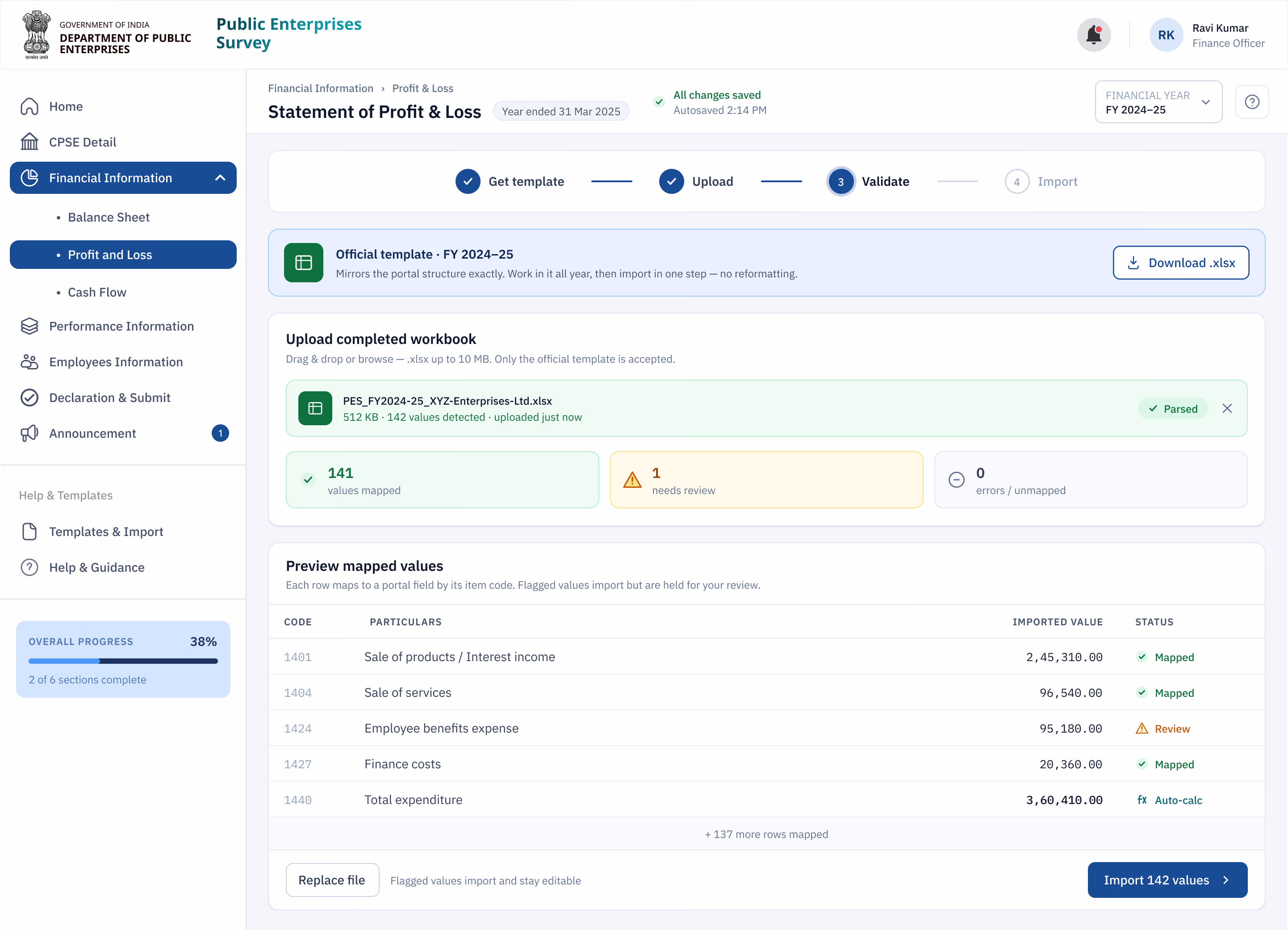
I could have built a better importer and called it a win. Instead I redesigned the process around it. Before every cycle, each organisation now receives an official Excel template that matches the portal's structure exactly. They keep working in Excel all year — the way they always have — and at the deadline the whole workbook imports in a single step, clean.
I didn't design an import button. I redesigned the year around it.
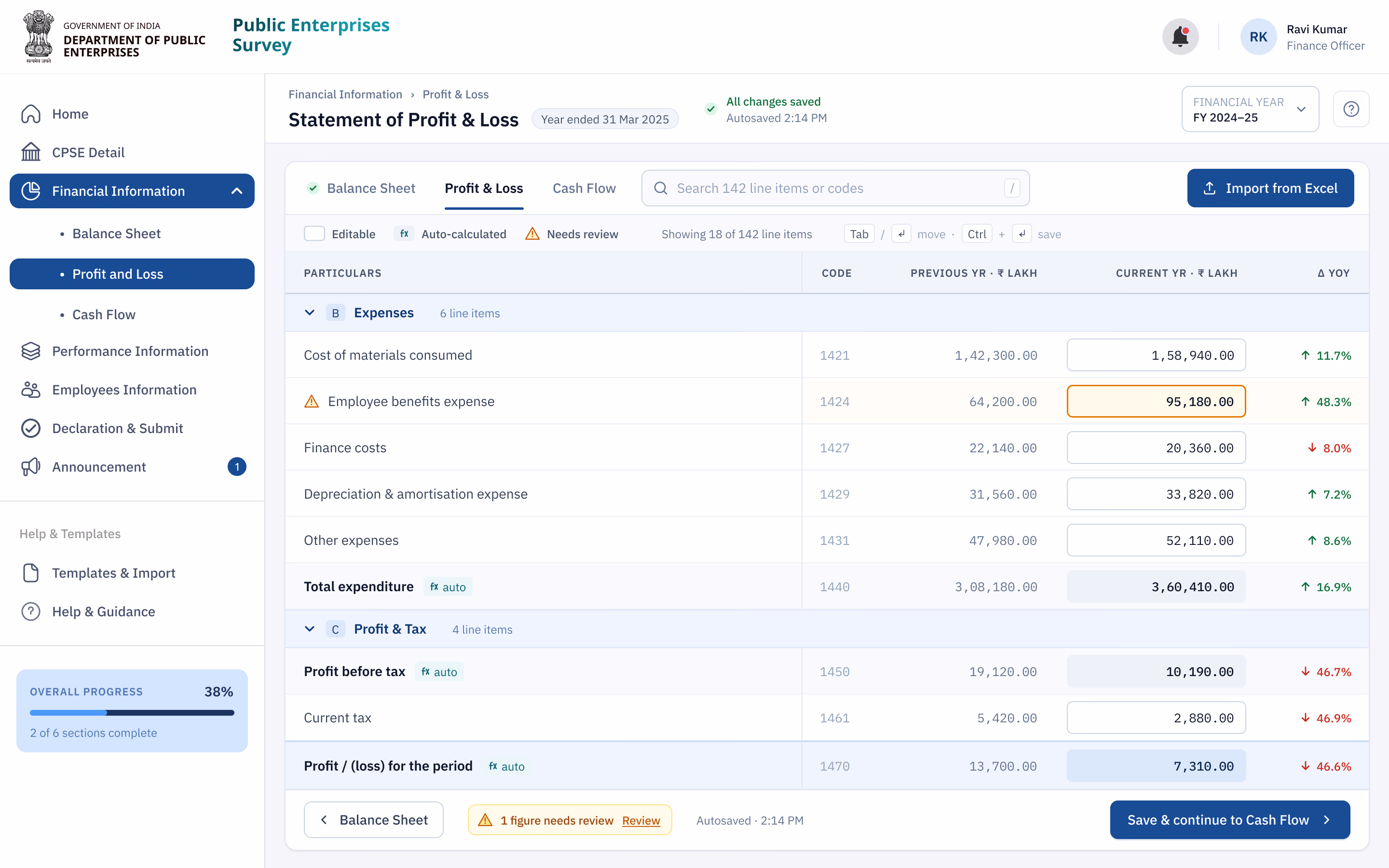
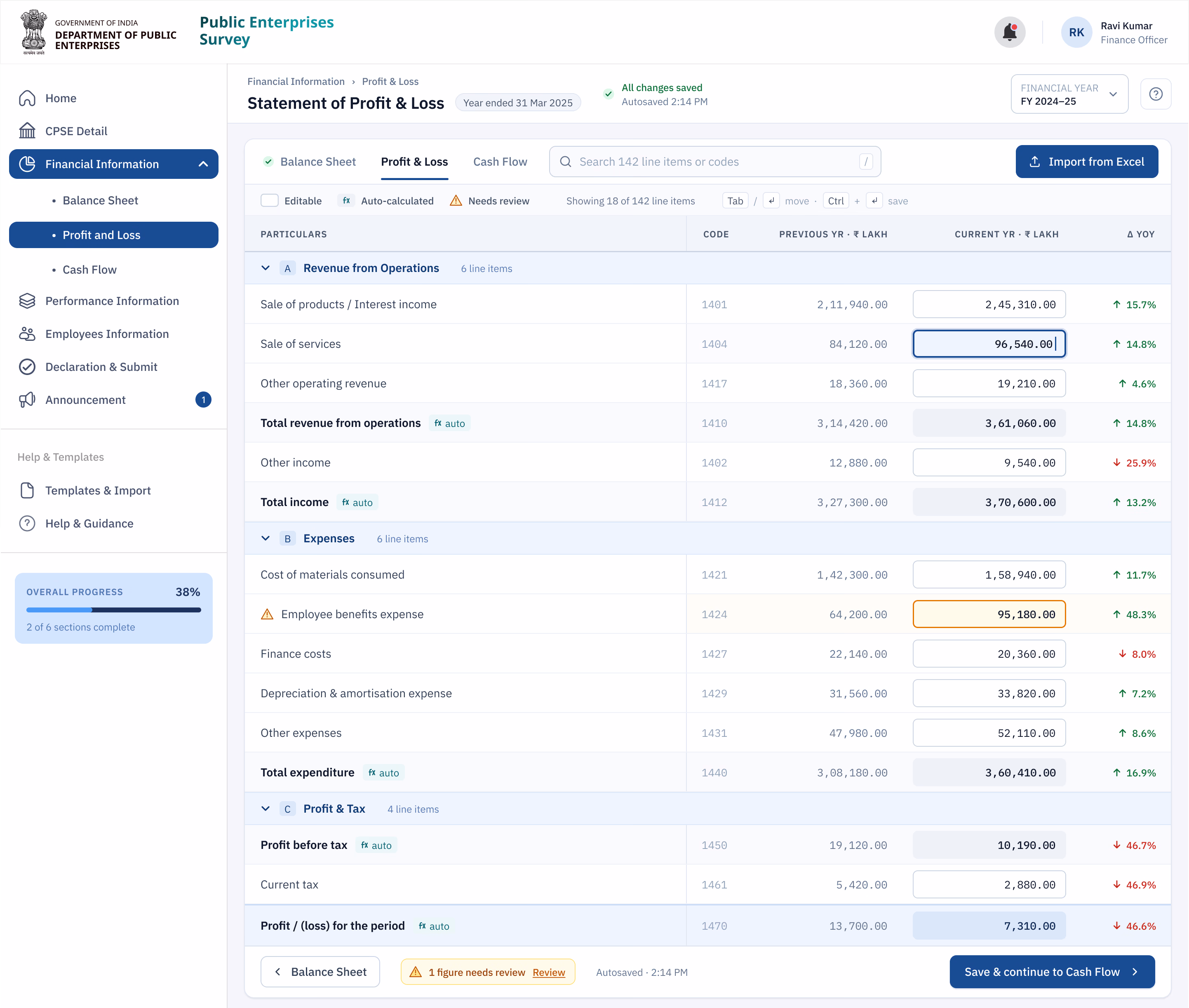
From there, a submission that used to take days of transcription became a short, guided pass:
- 01Start from the official template
The portal's structure, shipped as the spreadsheet teams already use — so the year's work lands in the right shape from day one.
- 02Import in one step
The completed workbook uploads directly, with validation catching mismatches before they become problems.
- 03Let the portal do the math
Every dependent figure is calculated as source values arrive — no manual recalculation, far fewer errors.
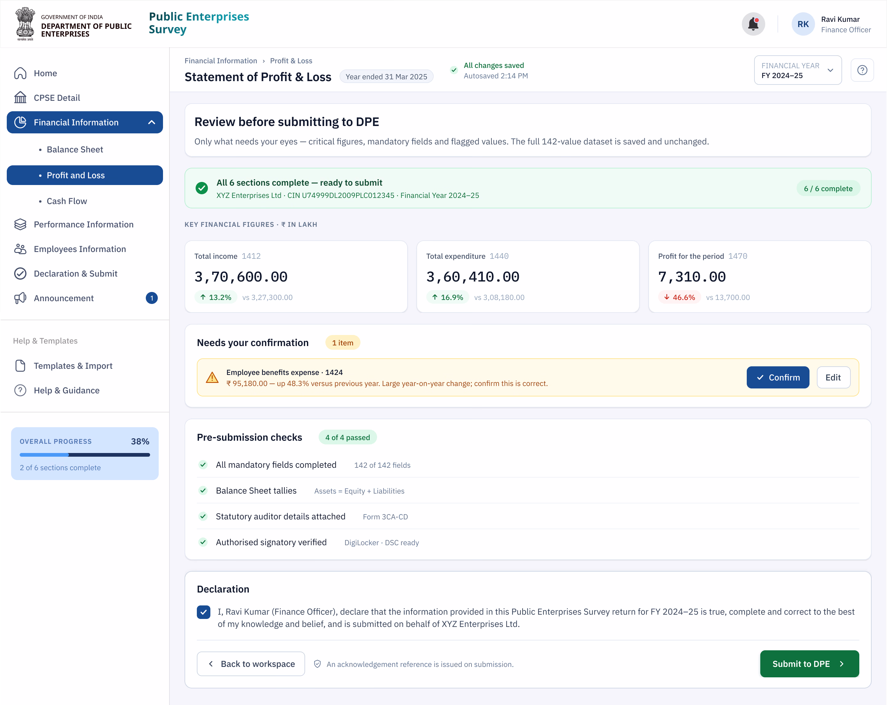
- 04Review only what matters
The final check surfaces critical figures, mandatory fields and warnings — not the entire dataset — so confidence is high and review is fast.
The one-step import
The unglamorous parts that mattered most
Finance professionals navigate by keyboard, work in long sessions, and can't afford to lose a morning's input. So the redesign was keyboard-first, saved progress automatically after every field, and held to accessibility standards as a baseline — not a finishing touch. None of it photographs well. All of it is why people trusted the new flow under deadline pressure.
What changed
The redesign didn't add technology so much as remove redundant work — and the time came straight back.
Now the portal works the way I already work. I'm not reporting the year twice anymore.
What I took from it
The most effective thing I did on this project was resist the obvious one. The brief asked for a friendlier form; the real win was admitting the form was in the wrong place and rebuilding the process so people's existing work flowed straight through it.
It's the lesson I keep relearning in enterprise UX: you rarely win by introducing a new tool. You win by understanding the one people already trust — and removing everything between it and the outcome.
Some details are abstracted to respect government confidentiality; the figures shown are approved for sharing. Happy to go deeper in conversation.