Onboarding architecture
Re-architecting government onboarding by deleting an entire account type
A national PhD portal was losing two of every three institutions before they finished signing up. The fix wasn't a shorter form. It was questioning whether a whole account type needed to exist at all.
- Role
- Manager, UX/UI Design — end-to-end (research, architecture, interaction, rollout)
- Timeframe
- 2025
- Context
- Visvesvaraya PhD Scheme portal · Digital India Corporation, under MeitY

Some details are abstracted to respect government / NDA constraints; figures shown are approved for sharing. Ask for more in conversation.
A system can be complete and still fail everyone it was built for.
The Visvesvaraya PhD Scheme portal had every box the administration could think of, faithfully turned into a form. On paper, it worked. In practice, it lost two of every three institutions before they finished signing up — and most of the ones who made it only got there by calling the PhD Cell for help.
I was brought in to make onboarding less painful. After a few weeks with the people inside it, I argued that most of it shouldn't exist.
The system worked. People didn't.
An institution couldn't shop around. To join the scheme, it onboarded here or not at all. So a drop-off wasn't a lost sale. It was an eligible institution stranded outside a programme it qualified for, and a support team spending its days unblocking people one call at a time.
I spent the first weeks with the people on both sides of the process — the PhD Cell administrators who fielded the calls, and academic and finance staff at a dozen participating institutions. The same story came back from every direction. It was never really about the forms.
We didn't get stuck on the form. We finished it, then waited weeks for verification — and ended up calling the PhD Cell just to find out if we were even in the system.
The pain had two shapes: waiting and repeating. Verification depended on government offices that move on their own clock, so institutions sat for weeks with no signal their application was still alive. And because the portal asked the same things of three separate identities, people did the same work over and over before the waiting even began.

Three doors to the same room
On paper, the portal asked for three identities — an Institute Account, a Head of Institute, and a Nodal Officer. In practice, all three walked through almost the same door: verify an email, verify a phone, upload documents, wait for a human. Only then could the institution upload its AICTE and NAAC certificates — and wait again.

You can't streamline your way out of a structure that shouldn't exist.
The fix everyone wanted was the wrong one
The first instinct in the room was always "make the form shorter." I want to be honest about what I weighed before reaching for something more drastic.
- Cut fields. Quick to ship — but length wasn't the blocker, and it wouldn't touch the three-week wait.
- Parallelise the three verifications. Still three identities, still a manual queue. A faster version of the wrong thing.
- Add a status tracker so institutions could watch verification crawl forward.
- A tracker only treats the symptom. Nobody should have to watch a three-week wait; the wait shouldn't exist.
- Every option that kept the Institute Account kept the duplication alive.
- The leverage wasn't in the screens. It was in the architecture beneath them.
An institute is not a user
An institute is not a user. It can't sign, verify, or be accountable — only people can.
Everyone treated the Institute Account as fixed — the thing the rest hung off. But an institution can't authenticate an email or stand behind a decision; only the people running it can. The account spun up a full registration journey and produced nothing the Head and Nodal Officer didn't already provide.
So I stopped trying to streamline it. I proposed deleting it.
Deleting an account type in a government system is not a small ask. It reaches into data models, downstream reporting, and years of institutional habit. I made the case to the PhD Cell with the journey map and the support-call log side by side — and we agreed to pressure-test it with real institutions before committing to anything.
The transformation

What I chose not to build
That one decision set the rules for everything after.
Collapsing four identities into one
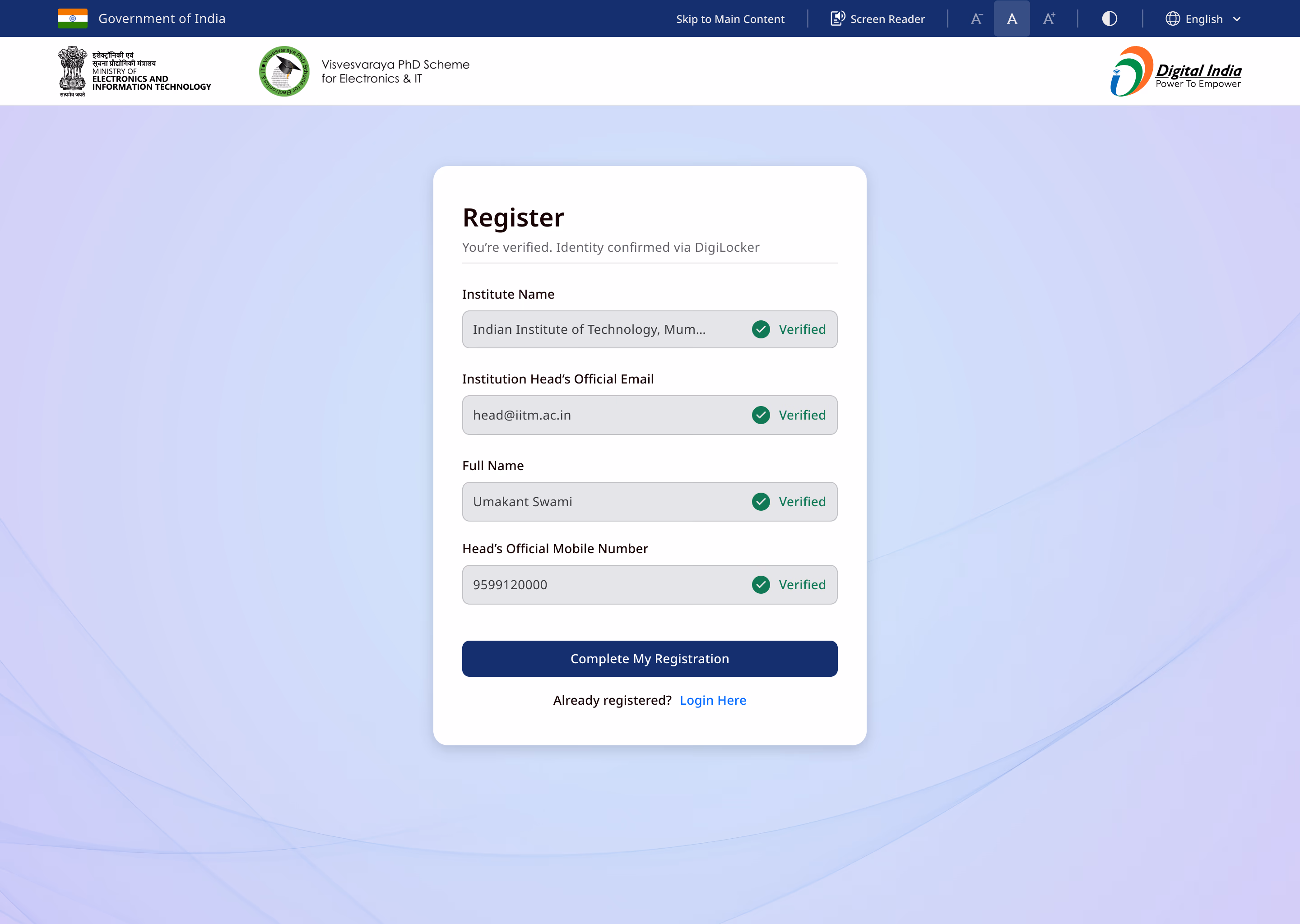
The new journey began with the only actor who could carry responsibility: the Head of Institute. They sign up, the institution is verified, and they invite their Nodal Officer. One authority, one source of truth, no duplicate identities.
- Four identities, near-identical onboarding
- ~3 weeks waiting on manual verification
- A support call to finish
- One verified authority — the Head of Institute
- Verification in minutes, no human in the loop
- No call needed
It was cleaner on paper than in the room. Walking it through with the PhD Cell and two institutions, a real worry surfaced: what happens when a Head of Institute leaves? Hanging everything on one person felt fragile to institutions used to roles changing hands. So the model grew a handover path — a Head can reassign authority, and the Nodal Officer holds continuity in between. The reframe survived; the design got sturdier because the people who'd live in it pushed back.
Designing the wait out of existence
The real bottleneck was never the interface. It was the wait.
Weeks of waiting wasn't a design problem — it was a trust problem. The portal didn't need a person to approve a scanned PDF if it could ask the system of record directly.
With the platform's engineers and the government integration teams, I moved verification onto DigiLocker. After verifying their email, a Head authenticates once and identity is confirmed in seconds, pulled from the source of record instead of a queue.
Eligibility moved next. Instead of letting institutions sign up and discover weeks later they didn't qualify, we wired AICTE and NAAC checks straight into onboarding. Eligible institutions continued immediately; ineligible ones never entered the system at all. This took negotiation — eligibility is policy, so the integration teams and I had to agree what could be auto-trusted versus flagged for a human to confirm.
Even the institution's name was a trap: a free-text field meant typos, duplicates, and records no one downstream could trust. I replaced it with search-and-select backed by AICTE data, so the right institution gets chosen, not typed.

With the Head verified, adding the Nodal Officer collapsed to a single email — invitation, SMS, and a DigiLocker link — and the officer joined without repeating a single setup step.
Built with the people who'd live in it
This was never a design handed over a wall. I worked alongside the PhD Cell throughout — both my client and my sharpest read on where onboarding broke — and kept a small group of institutions close, checking every change against reality instead of a mockup.
Where the mockups lied
Public infrastructure doesn't get to design for the average user. I built and tested against the hardest cases first — low-end devices, slow connections, assistive technology — and treated whatever broke there as the brief, not an edge case.
The most useful round was the smallest: walking the new flow with five institutions and three administrators. It caught two things the mockups hid. The handover gap above — and that verification was now so fast people didn't believe it had worked, so we added an unmistakable "you're verified" confirmation. Designing for the people with the least margin made every screen clearer for everyone else.
What actually changed
The biggest improvement was never visual. It was architectural — and the numbers followed.
And one number that never made the dashboard: the PhD Cell got its days back — no longer chasing verifications or answering the same question a hundred times a week.
What this taught me
The instinct on a project like this is to start moving fields around. The real work was upstream — asking whether one of the three accounts had any reason to exist. The best thing I designed here was a deletion.
It changed how I open every project since. Before I touch a screen, I ask what the system is forcing people to do that it should never have asked — and who needs to be in the room for the answer to hold. In systems this tangled, the strongest move is usually subtraction. The hard part is never seeing it. It's having the evidence, and the relationships, to make the case.
Some details are abstracted to respect government confidentiality; the figures shown are approved for sharing. Happy to go deeper in conversation.